The core idea
The executive layer should see a short AI health summary tied to decisions, not a wall of engineering telemetry.
Most AI dashboards are built for engineers and then shown to executives by accident.
They contain dozens of graphs, stage timings, token counts, and incident notes. Useful for diagnosis, yes. Useful for a monthly executive review, usually not.
Executives need a shorter artifact: one page that says whether the system is getting better or worse on the dimensions that matter to the business. For most AI products, that means quality, cost, latency, deflection, and incidents.
Context
Part of the LLM Evaluation hub. Related: LLM Evaluation Framework for Production, Cost per Successful AI Task, Why LLM Features Fail ROI Reviews, Exec Scorecard case study, and Reliability Retainer.
Why most AI dashboards fail executives
Most teams make one of two mistakes:
- they show too much detail, so the real health signal disappears inside the dashboard
- they show vanity metrics like requests, tokens, or anecdotal wins that do not support a decision
An executive scorecard is not supposed to explain every failure mode. It is supposed to answer: is the system healthier, riskier, cheaper, more valuable, or drifting off target?
Rule of thumb
If the scorecard cannot fit on one page and drive a scale, fix, or stop decision, it is probably a diagnostic dashboard, not an executive scorecard.
What an executive scorecard is for
A good executive scorecard does three things at once:
- shows trend direction, not just the latest snapshot
- ties system behavior to business impact and risk
- makes the next action obvious: scale, stabilize, redesign, or de-scope
That is why a scorecard needs fewer lines than an operating dashboard. Executives should be able to scan it in under two minutes and know where to ask follow-up questions.
The five lines that belong on the scorecard
For most enterprise AI products, these are the five lines that belong on the executive page:
| Line | Executive question | Recommended metric |
|---|---|---|
| Quality | Is the system still producing acceptable outcomes? | task success or grounded success rate |
| Cost | Are we paying a sensible amount for useful outcomes? | cost per successful AI task |
| Latency | Is user experience or throughput degrading? | P95 end-to-end latency, optionally TTFT for chat |
| Deflection | Is automation creating measurable business value? | deflection rate on eligible workflows |
| Incidents | Are reliability and risk under control? | severity-weighted production incidents |
Five lines is enough to govern the system at the executive layer. Everything else should sit in a drill-down section owned by engineering, product, or operations.
Metric definitions that survive scrutiny
This is where most scorecards break. The number is fine. The definition is weak.
Use definitions like these:
- Quality: successful outcomes on a curated production-like cohort, not model preference or thumbs-up rate alone
- Cost: total attributable cost divided by successful outcomes, not cost per request
- Latency: P95 end-to-end latency for the critical workflow, not average latency
- Deflection: share of eligible tasks resolved without human handoff inside a defined lookback window
- Incidents: severity-weighted count or incident points, not a flat tally where Sev-1 and Sev-3 look the same
The goal is not theoretical purity. The goal is a definition that finance, support ops, and engineering can all challenge without breaking the scorecard.
Good incident line
incident points = (Sev1 x 8) + (Sev2 x 3) + (Sev3 x 1)
This keeps one major outage from being obscured by a handful of minor issues.
Copyable executive scorecard template
If you need a starting point, use this format:
| Metric | Current | Last period | Target / budget | Status | Executive note |
|---|---|---|---|---|---|
| Quality | 84.2% | 82.9% | >= 83% | green | Improved after retrieval filter change; hold rollout plan |
| Cost / successful task | $1.48 | $1.71 | <= $1.60 | green | Routing + cache hit rate improvement reduced spend |
| P95 latency | 4.3s | 3.9s | <= 4.5s | yellow | Still inside budget but trending worse on tool-heavy cohort |
| Deflection | 36.5% | 31.2% | >= 34% | green | Measured on eligible intents with 48h lookback window |
| Incident points | 5 | 11 | <= 6 | green | One Sev-2 timeout cluster closed after retry budget fix |
This template works because it combines current state, trend, threshold, and interpretation in one view. A number without context creates more questions than answers.
Status thresholds: green, yellow, red
Do not improvise status colors after you see the month-end numbers. Define thresholds in advance.
- Green: inside target and trend stable or improving
- Yellow: inside budget but degrading, or slightly outside target with mitigation in flight
- Red: outside target with user, financial, or reliability risk that requires leadership attention
The executive page should make red items impossible to miss. If everything is permanently green, the scorecard is probably too forgiving.
How to present the scorecard in a monthly review
A strong monthly review is usually ten minutes:
- open with the five-line scorecard
- call out what changed materially since last period
- explain the one or two biggest drivers behind any yellow or red line
- end with the action: scale, stabilize, redesign, or de-scope
That keeps the meeting at the right altitude. The scorecard sets direction; the appendix and operating dashboards answer diagnostic questions later.
Common mistakes that make the scorecard lie
- Using average latency: user pain lives in the tail, not the mean.
- Measuring deflection on all traffic: ineligible tasks make automation look better than it is.
- Reporting total spend without outcomes: finance sees cost growth but not efficiency.
- Letting quality collapse into thumbs-up: satisfaction can lag behind real correctness failures.
- Counting incidents flatly: the scorecard hides severity and overweights noise.
- No cohort drill-down: the executive page looks healthy while one high-risk workflow degrades badly.
The scorecard should be simple, but it should sit on top of strict definitions and a drill-down path that engineering can defend.
What stays off the executive page
Keep these out of the top summary unless they are the direct cause of a business issue:
- token-by-model breakdowns
- trace waterfalls and span-level timings
- tool call distribution charts
- judge-model internals and rubric details
- cache hit-rate graphs without a clear connection to quality, cost, or latency
Those belong in the operator appendix. Executive scorecards should stay focused on outcome, economics, reliability, and risk.
Need an executive AI scorecard that leadership will actually use?
We help teams define defensible metrics, baseline current performance, and turn noisy AI dashboards into monthly scorecards that support real decisions.
FAQ
Questions readers usually ask next
What should be on an AI executive scorecard?
Usually five lines are enough: quality, cost per successful outcome, P95 latency, deflection or automation rate for eligible workflows, and severity-weighted incident count. Those five lines capture user outcome, economics, experience, business impact, and operational risk.
Why not show more metrics to executives?
Because executive scorecards are for decisions, not diagnosis. Too many metrics dilute signal, create debate about secondary details, and make it harder to see whether the system is getting healthier or riskier. Keep the scorecard short and push diagnostics into the drill-down appendix.
How should deflection be defined on an executive scorecard?
Deflection should be measured only on eligible workflows and usually with a lookback window, such as no ticket created and no agent handoff within 24 to 72 hours. Same-session deflection often overstates impact because delayed escalations are missed.
What is the right cost metric for executives?
Cost per Successful AI Task is usually better than total spend or cost per request. It ties cost to outcomes leadership actually cares about and prevents cheap-looking failure paths from being mistaken for efficiency.
Most important definition
Deflection should be measured only on eligible workflows and usually with a lookback window, otherwise the business case will be overstated.
Most common blind spot
Reporting total spend and average latency while hiding cost per successful outcome and P95 tails.
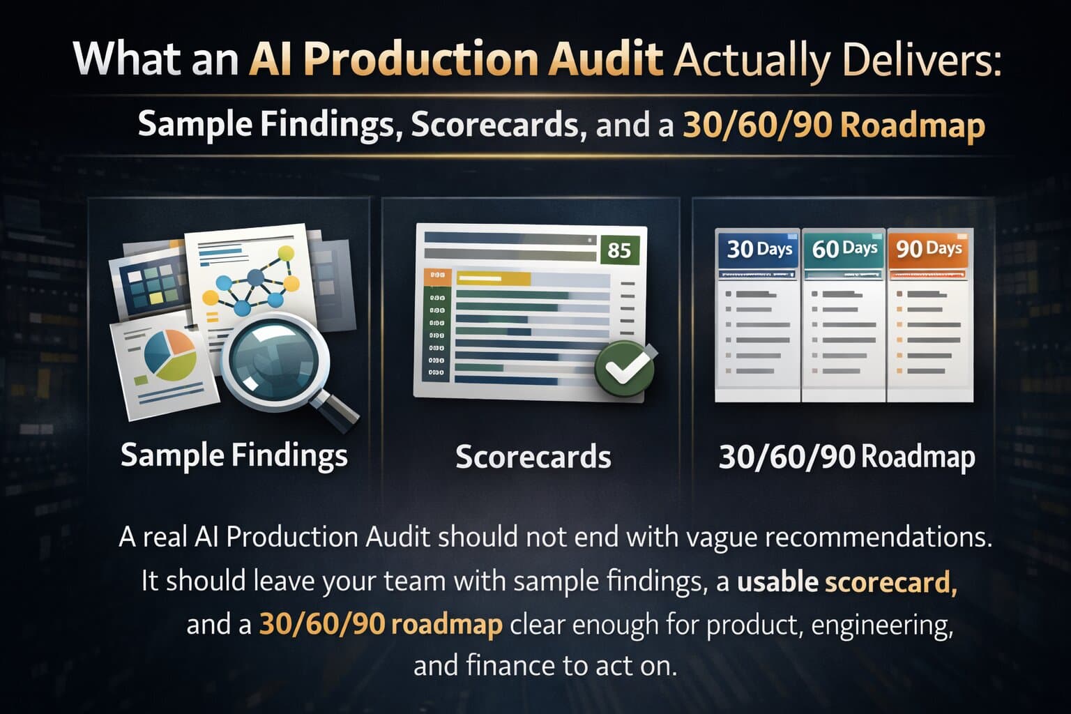
Need a decision-grade scorecard?
We help teams baseline quality, cost, latency, deflection, and incident risk, then turn that into a monthly leadership artifact. Start with an AI Production Audit.
Last updated
March 18, 2026